Tips to know about visual style guide for your brand
Brand style guide is one of the most essential documents any business can have it. Style guides are very important they ensure brand consistency throughout any collateral you produce.
Style guides contain all the necessary information to create whatever your company needs. Whether it be a website, advertisement, internal memo, or whatever else, this little document will make your life a breeze.
If you don’t already have a visual style guide, this is the time to start working on one. The good news is, it’s easier than you might think! Here are a few tips for getting started.
- Your logo is an important part of your brand, and you want it to be reflected consistently along the way. In your guide, you can dictate exactly how to use your logo. Whether you have a single logo that’s universally used, or multiple versions used for platform specific reasons, the visual style guide should provide examples of how to use and not to use the logo appropriately.
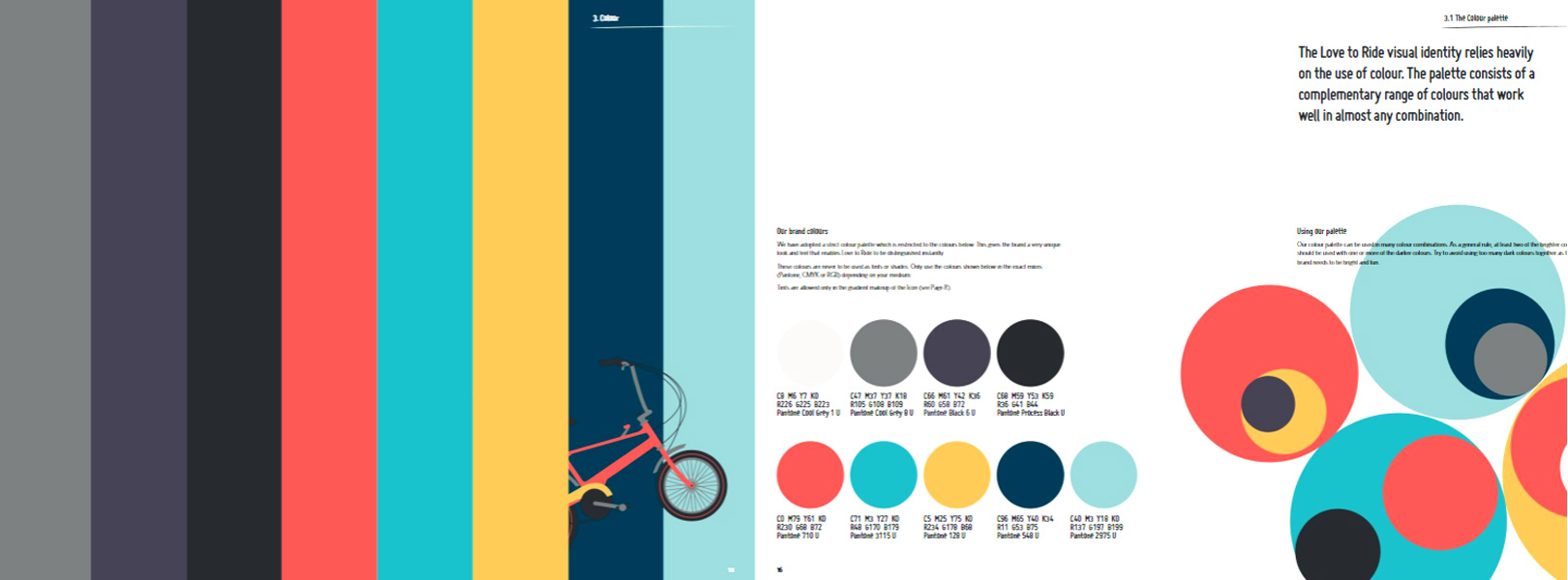
- The colors used by a brand should be spelled out with as much detail as possible. That means offering up not only hex codes for web use, but also equivalent CMYK and even Pantone color values for print. Create a hierarchy for the color palette, as well. How should each color be used? There should be a primary color, secondary color, and a color for text elements or shaded boxes.
- The typography palette works a lot like the color palette. Show typefaces and how they should be used. This includes everything from size, kerning, line spacing, and color. Don’t forget that beyond just the font faces used, you may also want to specify sizes for things like headings or photo captions. It’s also a good idea to specify if any particular styles or weights within the font family shouldn’t be used, if ligatures or alternate characters should or shouldn’t be used, and the like.
- Remember to include elements for your website or mobile app in your visual style guide. Create a separate section that details how to handle elements such as buttons, navigation, forms, animations, links, and hover effects.
- Iconography can really help set your brand apart. Include it in your guide to make sure it’s being used appropriately. These small images can also serve as visual cues for elements such as links to social media or guide the user through a design. Icons are likely a big part of your digital presence, and you want to ensure that icons aren’t randomly used (or designed) for every new project.
- Photography can also be a reflection of your brand. Specific styles evoke certain responses, and people can recognize a brand based off of a photo. While photos are necessary for all brands, if it’s an important part of yours it’s something you should include in your guide for any photographers you work with to reference.
However you decide to make your style guide, it should be clear and concise. Whether it looks so fantastic you want to make it available for all to see, or not so great and you just want to keep it within the family, it should do one thing: make the design process smooth and simple for all.